PayPal Zettle Business Management System
OVERVIEW
The Challenge
The Impact
After researching the small business space, it seems PayPal's Zettle could use an upgrade to better compete with Block (formerly Square) the leader in the industry
Enhanced splash screens to ensure impactful first impressions, and implemented dark mode for improved accessibility and user experience.
My Role
My Tools
My Team
Timeline
THE PROCESS
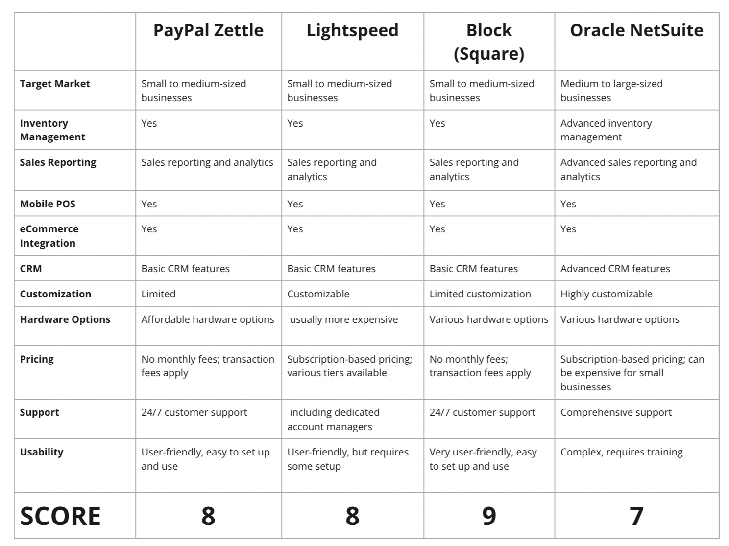
After I performed competitive analysis, I decided to research further into Block (formerly Square) because it had many more positive reviews of how user-friendly and intuitive it was.
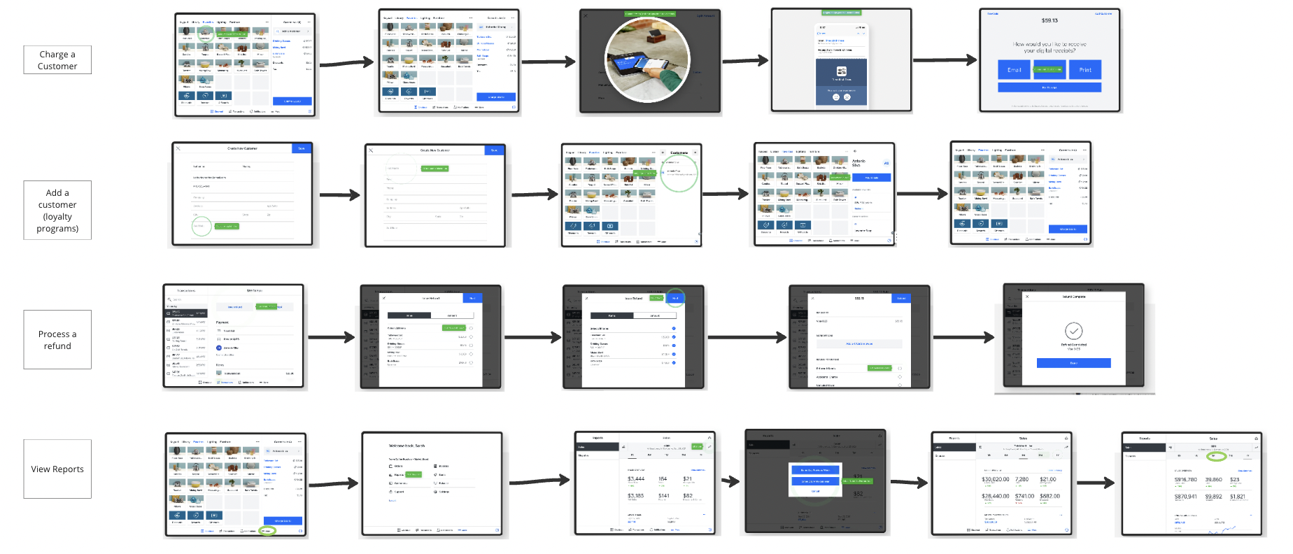
To better understand the Square POS system, I took screenshots from their demo and compiled these into my Miro board
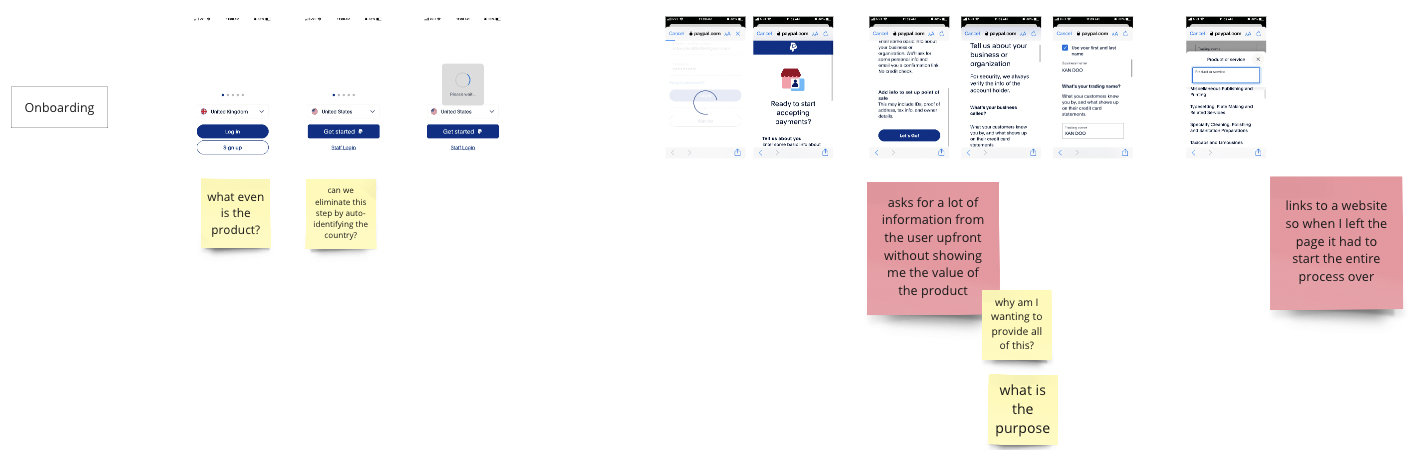
I also went through the full PayPal Zettle onboarding process personally to better understand painpoints. Again I screenshotted, and added to a Miro board. Here I point out in red stickies the pain points, and in yellow some questions I would want to answer to provide a better experience for the users.
DESIGN DECISIONS
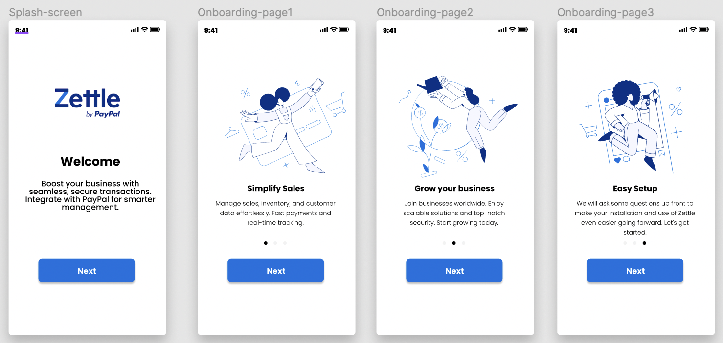
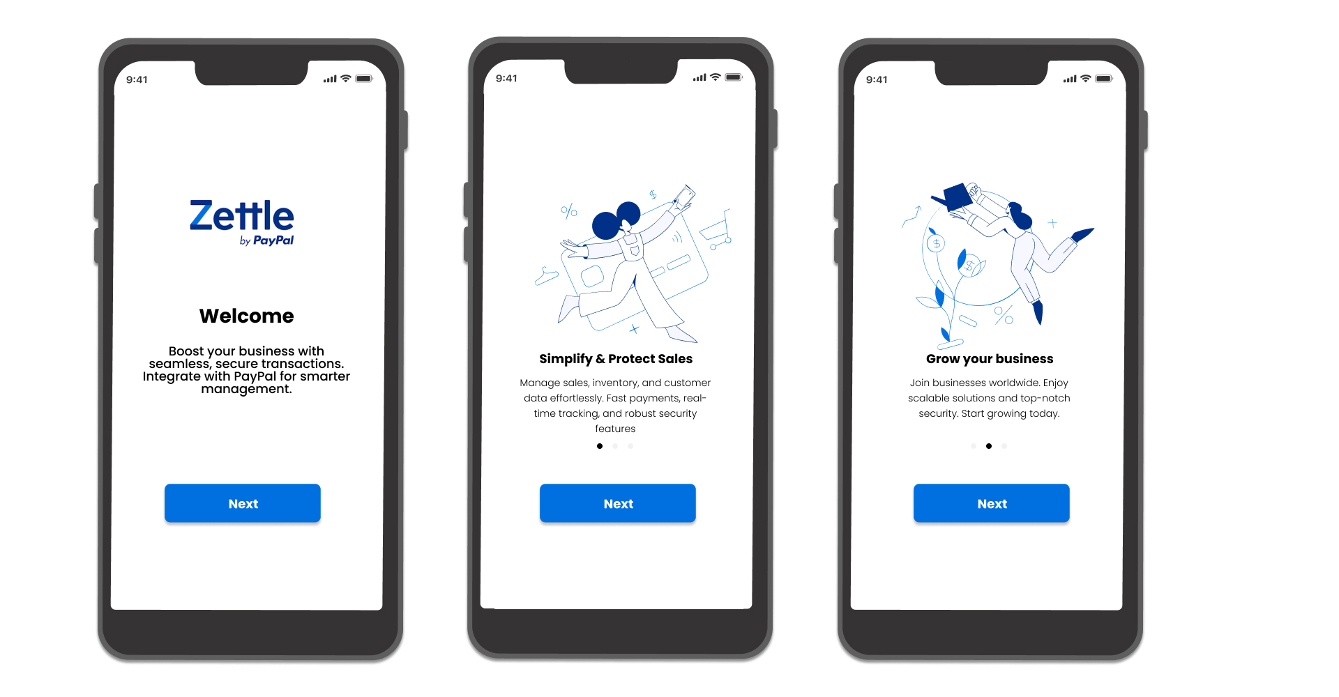
The first design decision I made was cleaning up the splash screen. The purpose of a splash screen is the first introduction of the product to the end-user, and first impressions are everything. Splash screens are also mandatory in iOS systems.
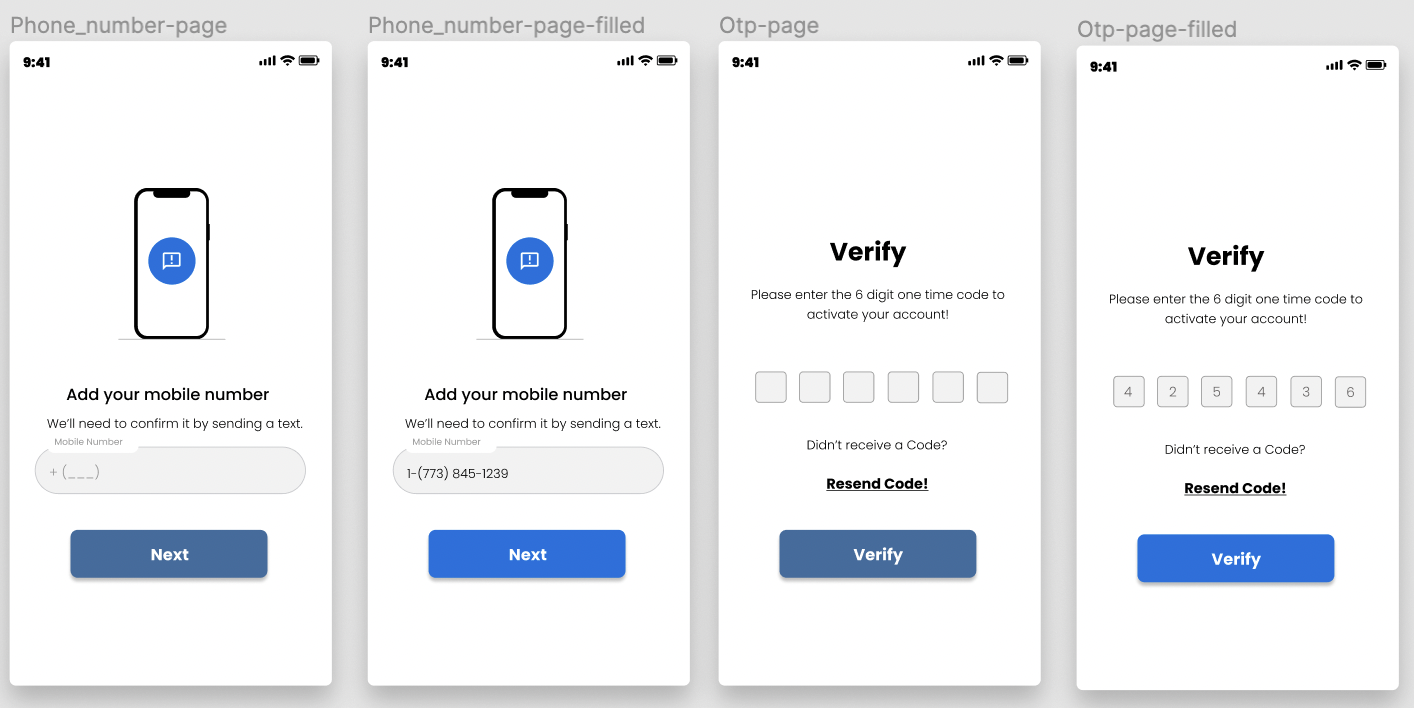
The next aspect I tackled was secure authentication. This is used in the FinTech industry to enhance security and can significantly improve user trust and satisfaction.
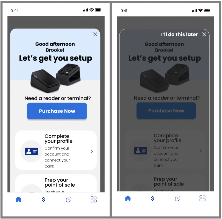
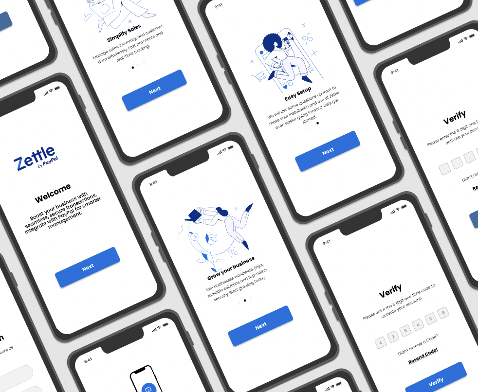
My next decision was based on the legacy system's hamburger menu. I felt the usability was awkward and not intuitive on a mobile application. I removed that icon and the notifications icon and instead added a bottom row of icons for easy access to the most used functionalities. Notifications don’t need their own button, and would instead populate naturally on the home screen. I added a home button, a sale button, a reports button, and “additional functionality” button. I made assumptions on these because I didn’t have access to user research.Within the home screen, it’s clear the first steps the user should take are setting up their account to make the most of the app. Allowing the user to exit out of this home screen and automatically see the home screen as it would naturally look will help expert technology users get excited about utilizing the functionality that the app provides. Without this option, the user likely feels frustrated.
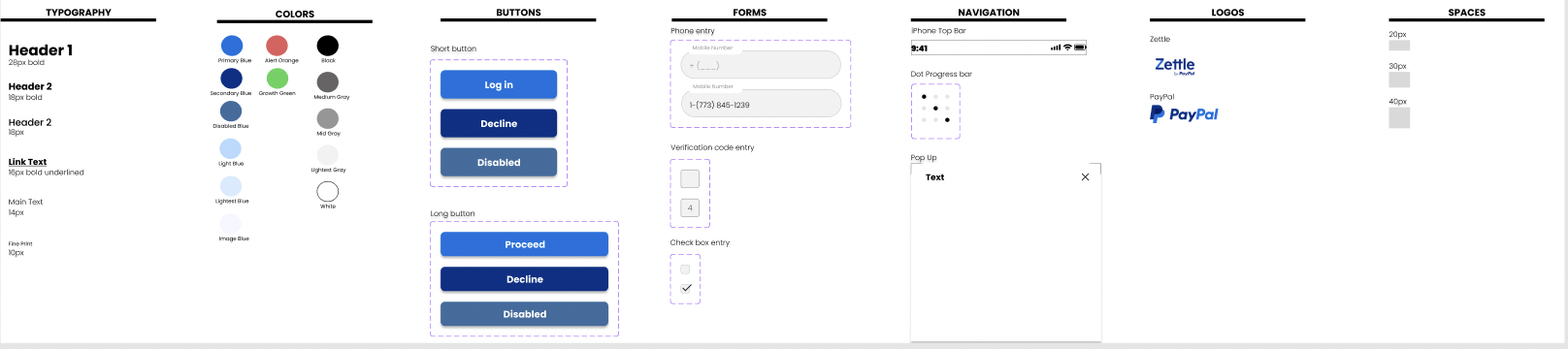
While I was creating these screens, I slowly started piecing together my design system. I changed the primary blue to a lighter blue as seen in the PayPal logo to be more inviting into the experience. Darker colors are typically used primarily as decline or close buttons, so I made the darker blue my secondary color.
View the full high-fidelity prototype by clicking the image
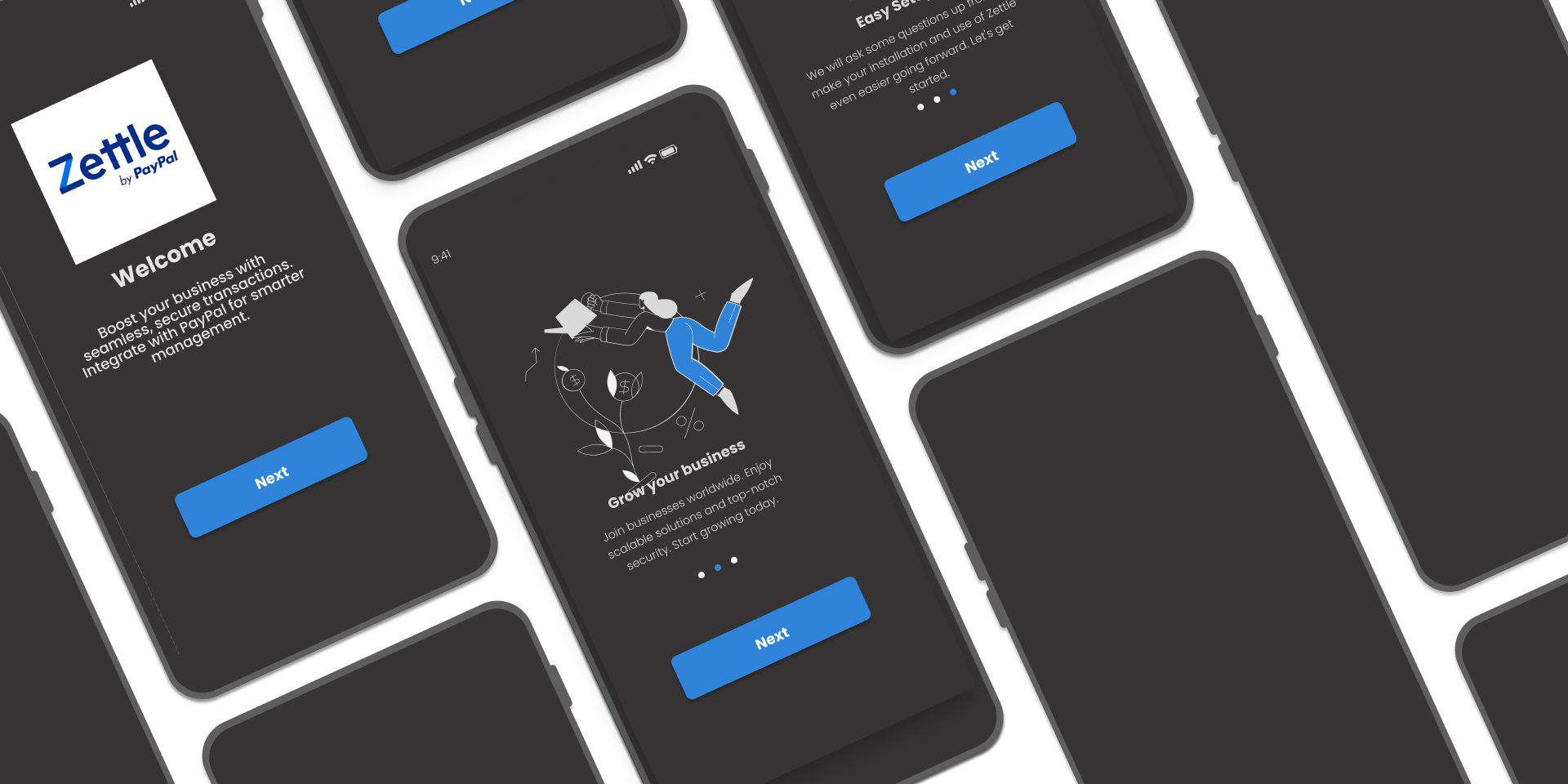
I also created a dark mode (have yet to implement where in the information architecture it would be possible to view this mode). Dark mode in UX is crucial for accessibility because it reduces eye strain, especially in low-light settings, which is beneficial for users who spend long hours on screens. It also improves readability, particularly for those with visual impairments, by enhancing text contrast. Offering dark mode as an option caters to user preferences and enhances the overall user experience, aligning with accessibility principles.
View the full high-fidelity prototype by clicking the image

